Contrast calls attention to the dramatic differences between the components of an image. We most often associate contrast with the element of value and significant changes from light to dark within an image. When presented with the juxtaposition of light and dark within a composition, our attention gravitates to the place where the darkest and lightest values meet. This same principle of attention holds true for other elements as well. For example, an image may seem to vibrate when colors from opposite sides of the color wheel are placed next to one another. When using highly saturated colors, these combinations can even be difficult for the viewer to look at for a sustained period.
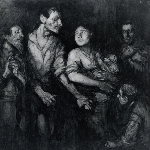
John Henry Amschewitz’s drawing of refugees uses value contrast to draw immediate attention to the faces of the two central figures in the composition, emphasizing their plight and ensuring that they are individuated through their expressions and not just seen as generalized entities. Though they are surrounded by other figures, the background behind the two central figures darkens significantly in comparison to the corners of the image, creating contrast in relationship to the stark white used in the faces. In comparison, the supporting figures fade into the background.